Ellipse App
The Gender-Neutral Period Tracker App for Buds Who Bleed

This app began as a conversation between friends: venting about our cycles and symptoms. We all had bits of information, but there was a clear gap in our knowledge about our own bodies. We also noticed an inclusivity gap and tonal dissonance among period-tracker apps currently available on the market; they were all too upbeat for a situation which causes a lot of stress for a lot of people. From there, we set out to design a gender-inclusive, down-to-earth period tracking app with a view towards holistic health throughout the month. We decided to prioritized the following:
Gender inclusivity and a friendly, realistic voice for copy.
Education on the four phases experienced throughout the month and phase-appropriate suggestions for exercise, nutrition, and coping mechanisms.
An intuitive design that allowed for a variety of interactions to accommodate varying energy levels: from the bare minimum to very detailed.
A design that presented information in an easily digestible way.
The final Ellipse app provides useful information and tips throughout the month in a friendly, empathetic voice and allows the user to track their cycle dates as well as symptoms and effective treatments. The design is intuitive with a calming atmosphere that caters to the diversity of potential users.
Candace Graue, Sarah Spence, Shannon McLeod, Rachel David
Tools:
Trello, Figma,
Google Drive,
Canva, Zoom
Team:
User Research
With inclusivity as one of our main goals, we knew we would need well-rounded research that uncovered as many pain points for potential users as possible. We interviewed a variety of people in terms of age and gender-expression with the following research goals in mind:
To understand the user’s experience throughout their menstrual cycle, especially regarding their comfort level.
To understand the user’s needs when it comes to education and resources for their menstrual cycle.
To understand the challenges users face throughout their cycle, and the roadblocks to empowerment and education.
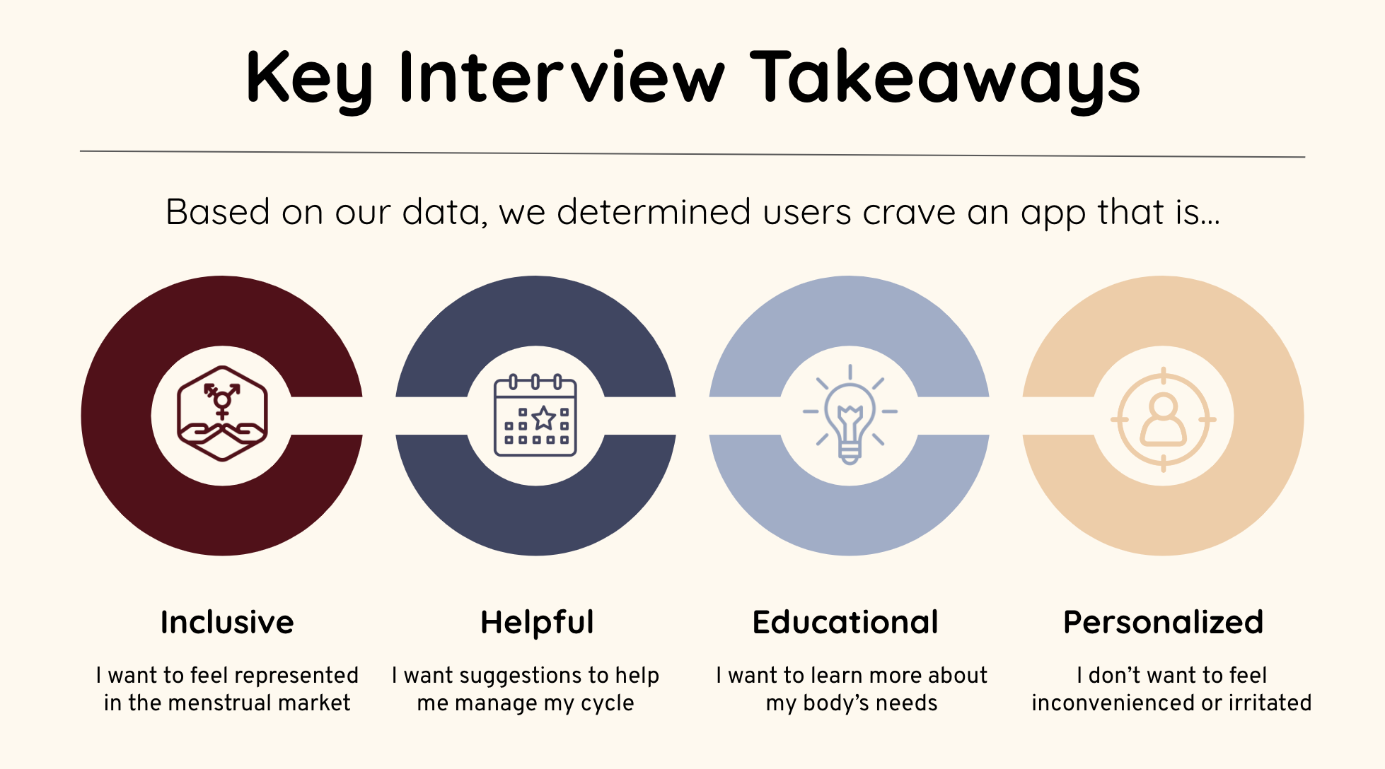
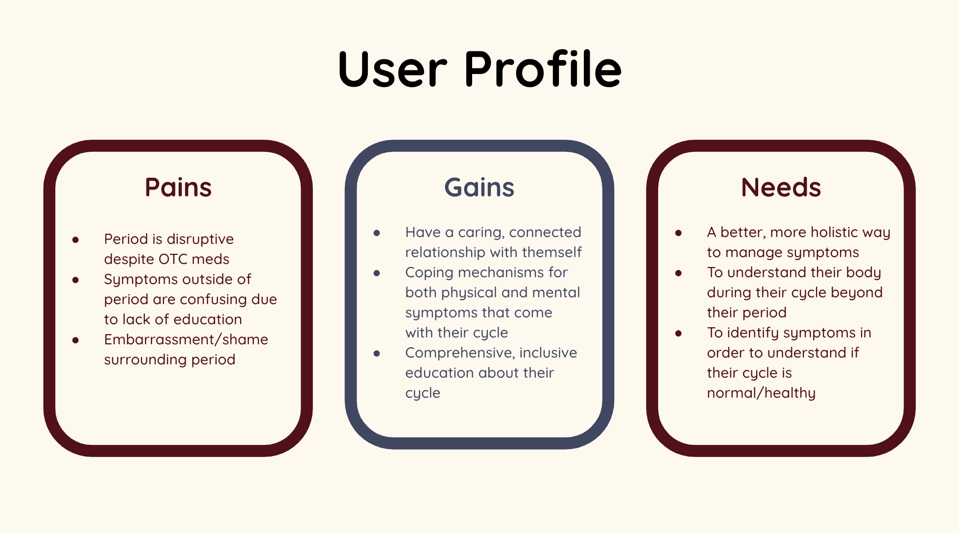
We interviewed eight people and distributed a survey, then analyzed the data to gather key user insights. From these insights, we synthesized a user profile to help guide us in our design decisions.

Definition and Synthesis
During our research, we discovered that users lack access to inclusive, comprehensive information about their menstrual cycles. Most users also experience some degree of disruption to their daily life as a result of their cycle. Many people had tried to track their periods, but found it difficult to maintain the habit. We believed that Ellipse would help users better understand and manage the symptoms that arise throughout all four phases of their cycle. The challenge would be to make tracking as easy, but also robust, as possible, in order to not cause more stress. We also wanted to remove the stigma around menstrual cycles to provide a safe space for learning.
We knew, of course, that Ellipse would not be the only period tracker on the market, so we conducted a competitor analysis. We researched several direct and indirect competitors to draw inspiration from, but also to identify where we could stand out and if there were any gaps that needed to be addressed. Our main takeaways for potential was to continue to focus on inclusivity, to highlight education and health, and down the line, to find a way to make Ellipse accessible to all, without a paywall.

Ellipse helps users with menstrual cycles to better understand their body during each phase of their cycle and the changes that come with it by providing educational resources delivered through inclusive design.
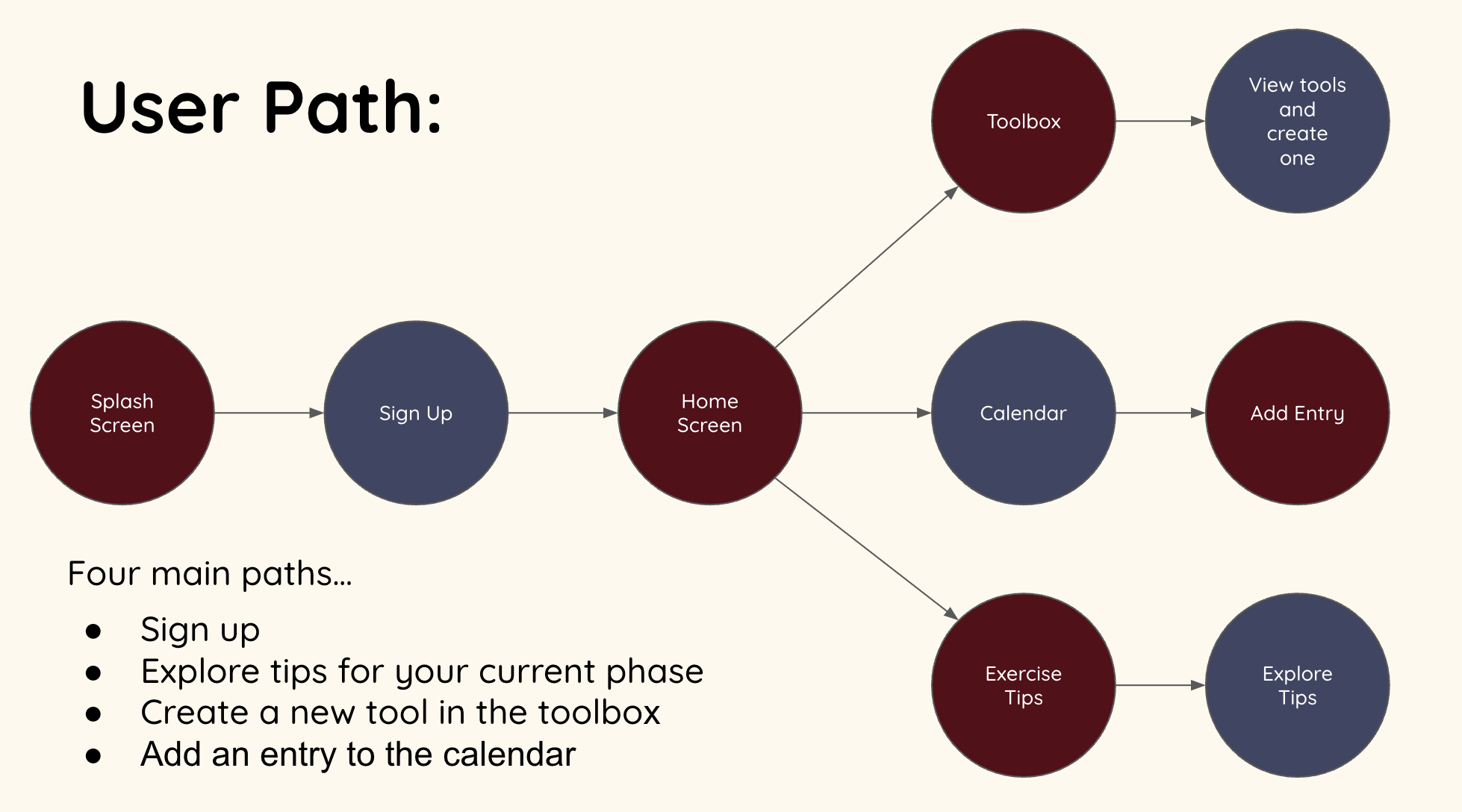
With our goals and potential defined, we set out to determine which user paths we would design. As we were on a tight deadline of three weeks, we could not feasibly built out the app entirely. Therefore, we identified four key user paths that would be the foundation of the app’s capabilities. These included:
A friendly, easy User Onboarding flow.
A Landing Page that provided information and tips for the user’s current phase in their cycle.
The Toolbox and tool creation flow that would help users deal with the lows of their cycle and take advantage of the highs.
A daily Diary entry flow with a variety of trackable options that would be reflected on a Calendar.
We assigned each of these flows to one of our team members. I personally took on the toolbox page and the flow of adding a new coping tool to a user’s repertoire.
After defining the core paths and functions of our app, we started the ideation process to determine a direction for the visual style. We utilized a moodboard to brainstorm ideas. Because a full cycle contains four phases, we originally wanted to use season-related imagery and colors. You can see this reflected in our first moodboard. Using this color palette, we created paper sketches, followed by basic and mid-fi wireframing. While we worked on the mid-fi wireframes, the entire team struggled with our chosen color palette. In addition to aesthetic issues, we also found some screens were having accessibility issues regarding contrast. This was a major time setback, but we came back together to brainstorm a new palette, which focused on cooler, more analogous colors. Because this new color palette did not lend itself to our original season theme, we discarded that theme in favor of a more neutral one. This necessitated creating new icons for our style guide.
Ideation
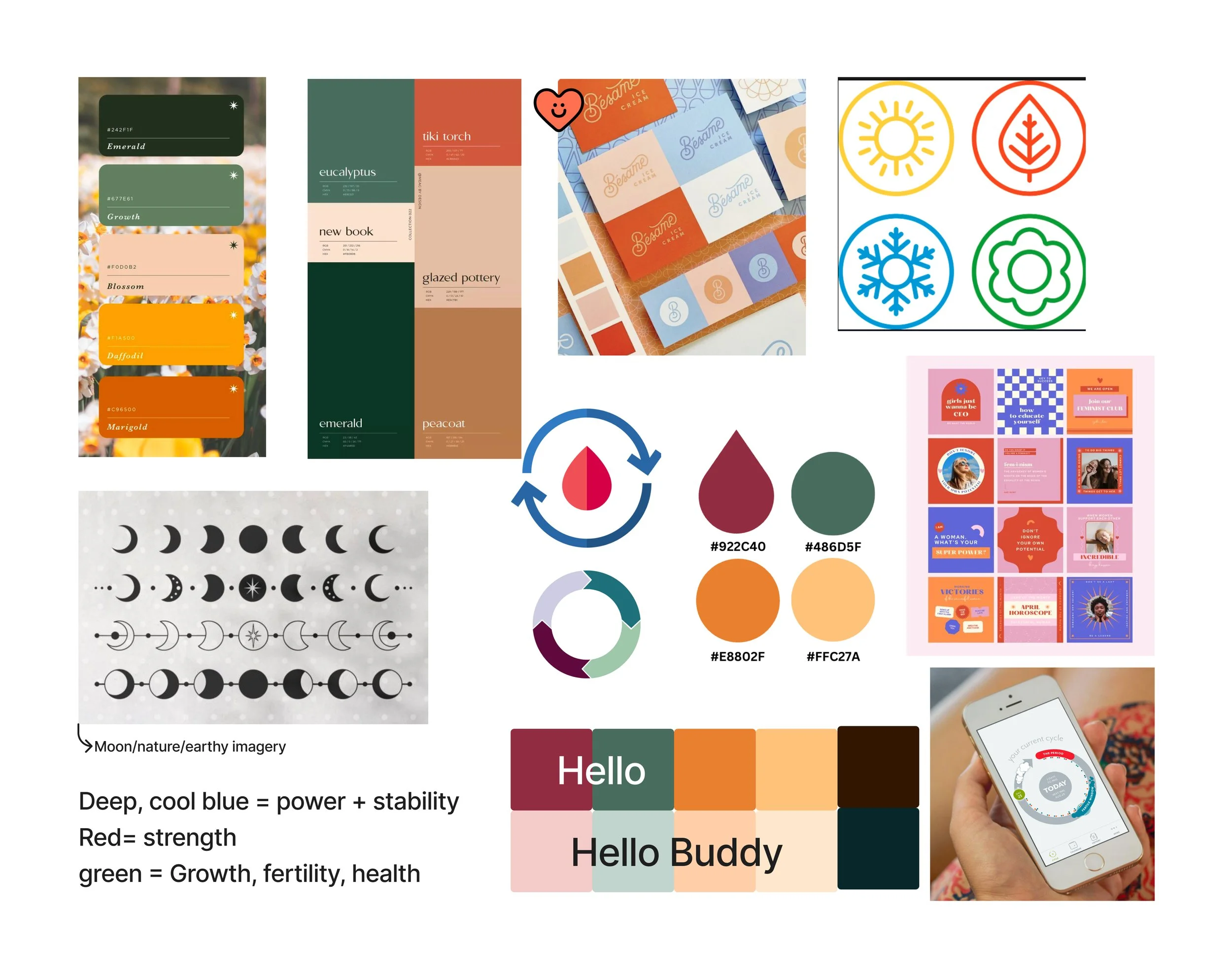
The old color palette (seasonal and comfy)

The new color palette (soothing and calm)
For text, we wanted to choose a font that reflected the diary-like entries that users would make. We leaned toward fonts that looked like handwriting without sacrificing readability. After much deliberation, we settled on Quicksand, which was friendly, casual, but still sophisticated and readable at small sizes. We also included Satisfy for a few key areas to add some flair.

Wireframing & Prototyping
Throughout the process of building the wireframes and creating the prototype, we frequently came together for iterative feedback sessions to help each other improve our designs and ensure a cohesion across the app. As stated above, we also had to make a major iteration when we reimagined our color palette. Please see below for the development of each user flow!
Onboarding

Initial Wireframes

First round of mid-fi wireframes with old color palette
Our focus for the Onboarding flow was on ease of entry and a welcoming voice. Knowing that some users would possibly be downloading the app during the worst part of their cycle, we opted to defer major profile-building questions for a separate flow to be made in the future. We didn’t want to overwhelm the users early-on. Team feedback was mostly centered on text decisions, standardizing elements, and incorporating a progress bar.
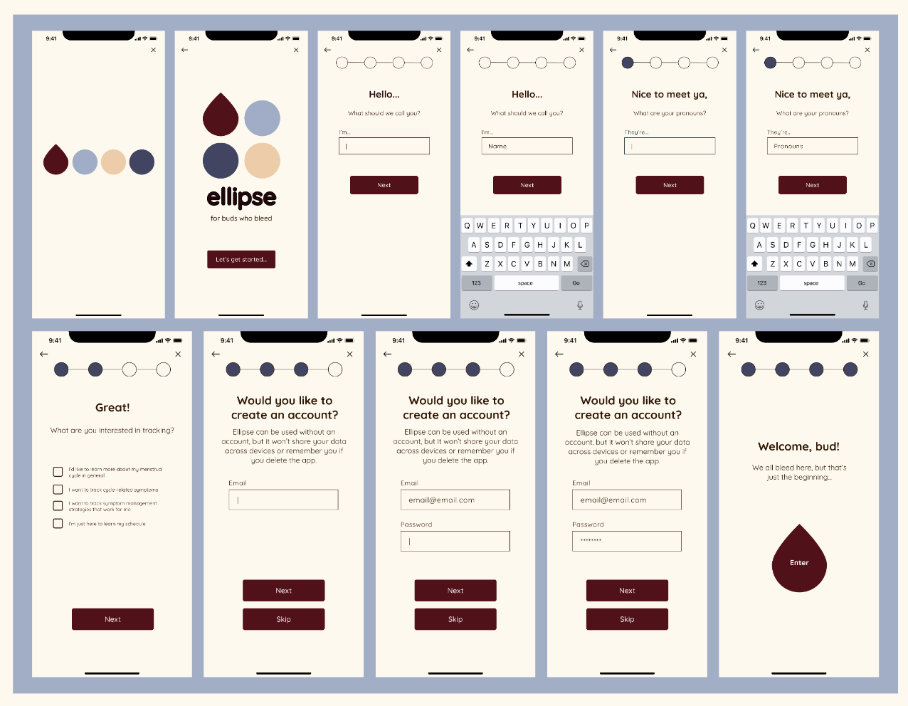
Second iteration of mid-fi/prototype frames with team feedback incorporated
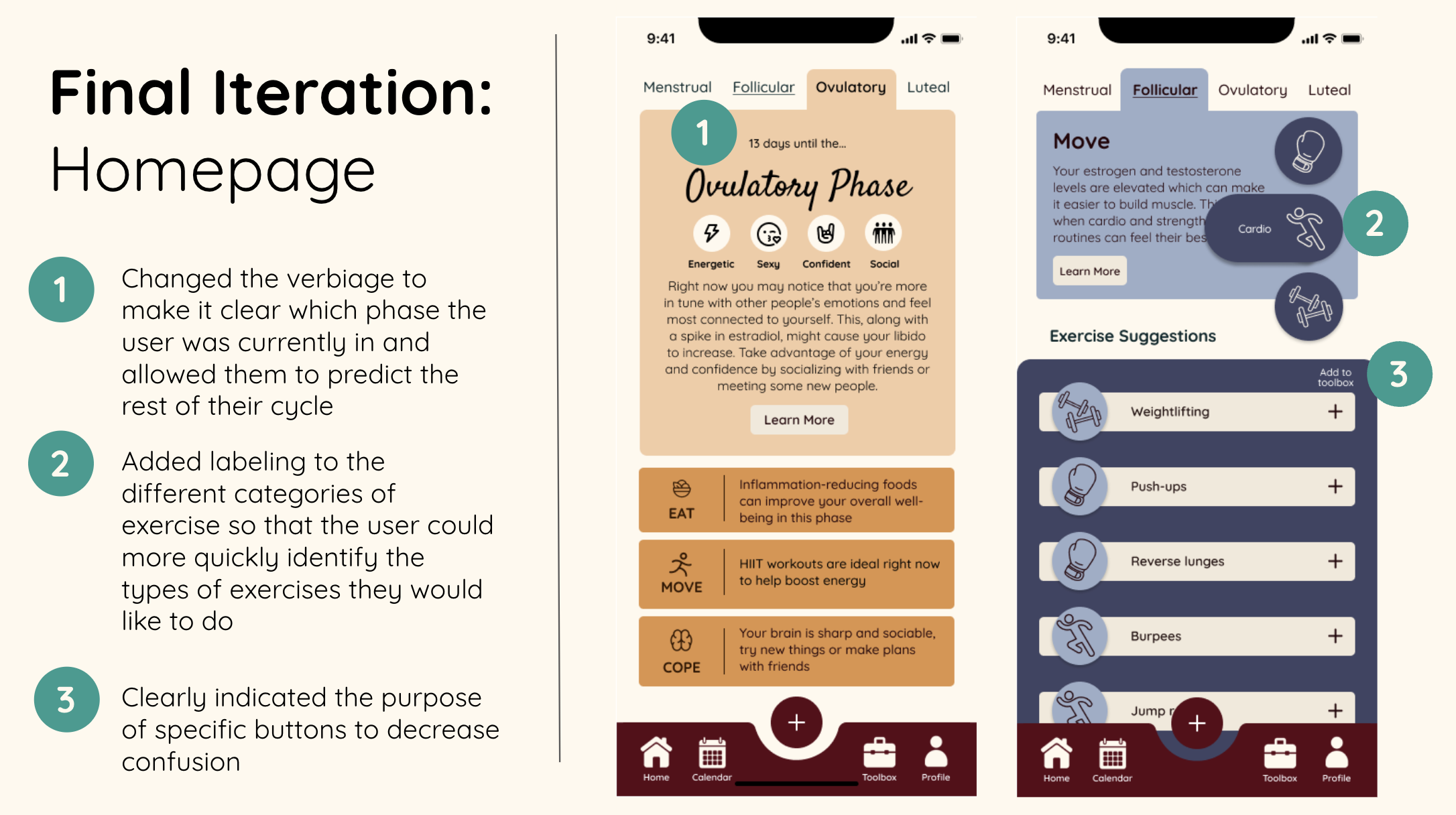
Landing Page
Initial Wireframes

First round of mid-fi wireframes with old color palette
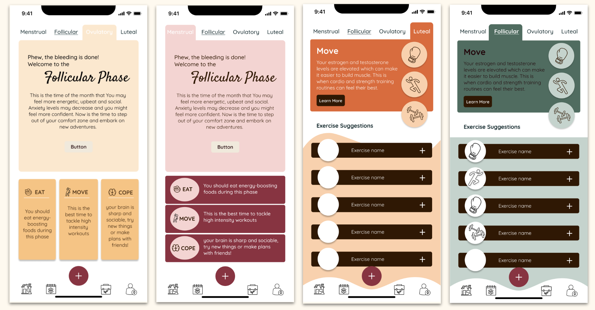
For the Landing Page, the challenge was to display educational information, management information, and phase information all at once, without being overwhelming. These pages have the most text in the whole app, so font choices were very important, as well as iconography to help break up the text. We worked together to decide the best orientation and weight for all the elements.
Second iteration of mid-fi/prototype frames with team feedback incorporated

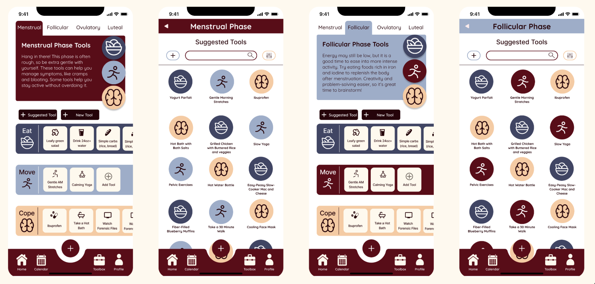
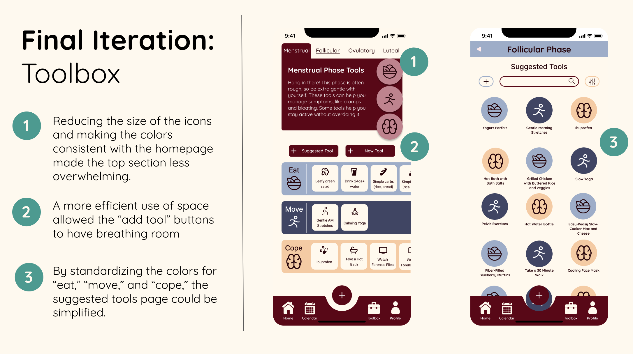
Toolbox
Initial Wireframes
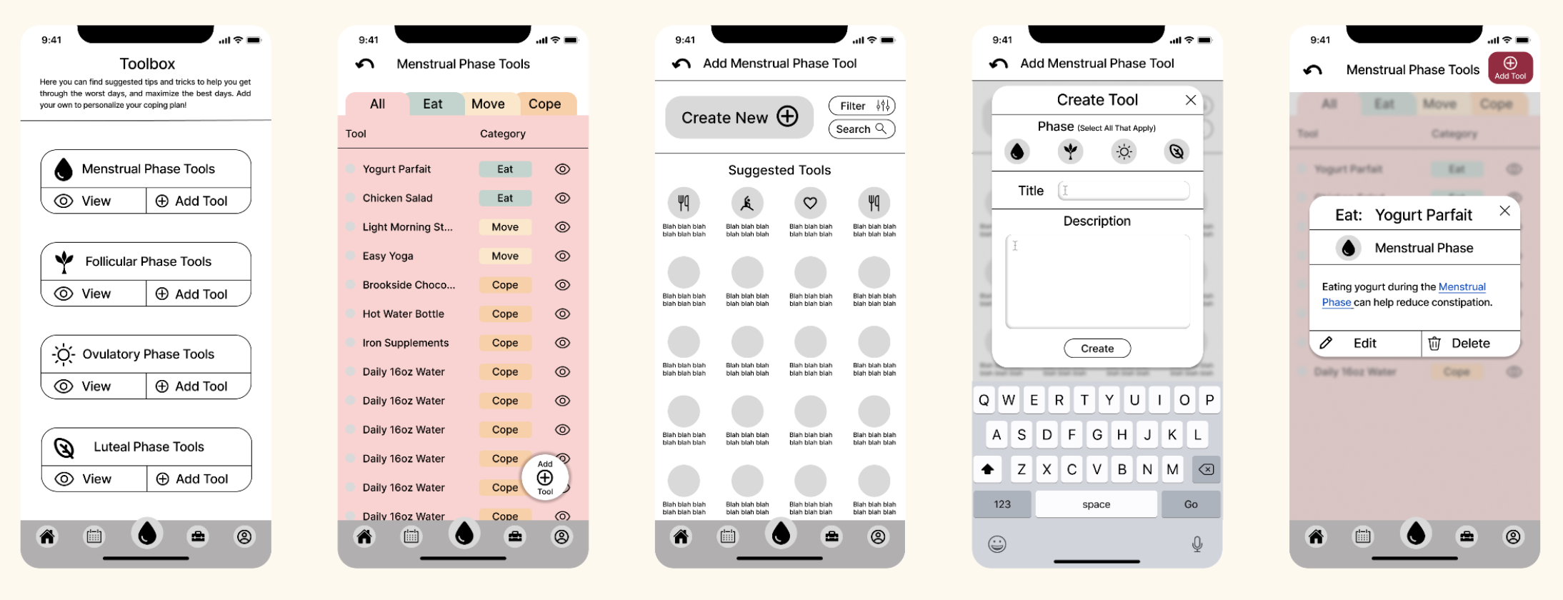
First round of mid-fi wireframes with old color palette
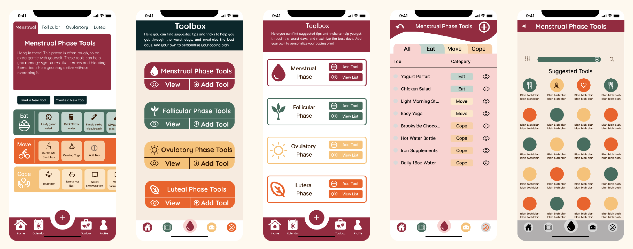
The Toolbox was an area with the most interactive elements. It also had a lot of information and categorization that needed to be displayed in an appealing way. I used A/B testing to choose between different layouts. There is extensive iconography for the different possible actions throughout the flow. I worked hard to make all of the icons clear and intuitive to use. I played with our color combinations in a way that would later be simplified.
Second iteration of mid-fi/prototype frames with team feedback incorporated
Calendar Page
Initial Wireframes


First round of mid-fi wireframes with old color palette
The Calendar was anticipated to be the most frequently used flow, a daily entry that needed to be intuitive and simple. We decided on making all tracking optional, to accommodate different motivation levels. We wanted users to have a robust tracking system to get a holistic view of their cycle and how it affects their entire lives, but we didn’t want to force them to enter this information every time. We also played with the idea of a “goblin-mode” for users with severe symptoms during menstruation, as a way to tell the app to bother them as little as possible. This is indicated by the small skull symbol on the upper left. After some discussion about clarity, we scrapped this concept and replaced the icon with a “stats” icon to be developed in the future.

Second iteration of mid-fi/prototype frames with team feedback incorporated
Iteration & Final Design
Once our prototype was ready to go, we immediately moved to testing. We tested 8 people, focusing again on diversity of gender expression and age. For each user flow, we incorporated a few key changes into our final prototype.


Ellipse:
For All Buds Who Bleed
Throughout this design process, our team was frequently reminded how much a tool like this is needed, with unlimited access regardless of financial status. While this was only an “in-theory” project, our team became very passionate about the cause. We look forward to possibly bringing Ellipse to market and finding ways to keep it free for everyone. We imagine we could achieve this through affiliate product links (Cramps? Buy this handy heating pad!) and by fostering partnerships with international non-profits that help provide menstrual care and birth control resources to communities in need.
We also spoke of future plans to find ways to “gamify” the experience to help users stay on top of tracking. Ellipse has the potential to greatly improve the lives of its users, but this is highly dependent on user participation, which can be challenging to maintain. We would love to be able to tackle the design challenge of making consistent Ellipse usage as smooth as possible.
All that being said, our team is extremely proud of our Ellipse app. We believe this app achieved its goals of being intuitive, gender-inclusive, friendly, and useful for a wide-range of users. I hope you enjoy the full prototype below.
