The Center on Colfax
A Welcoming and Celebratory Website Redesign

The Center on Colfax is an organization that seeks to “engage, empower, enrich the lesbian, gay, bisexual, transgender, and queer community in Colorado.” They provide services, resources, and community events for all ages that create a lasting positive impact on the community. As part of the queer and ally community ourselves, our group was eager to lend our talents to such a noble cause.
*This design is a proposal only; the Center has not yet adopted this design.
Our main goals with this redesign were to:
improve the information architecture to create a smoother navigation experience.
clarify and highlight the many services and resources the Center provides.
jazz up the site’s visuals to create a fun and welcoming atmosphere.
The final site design is an enjoyable, friendly experience that is intuitive to use and easy to navigate. The design encourages users to return again and again.
Trello, Figma,
Google Drive,
Canva, Zoom
Tools:
Team:
Candace Graue,
Rachel David,
Sarah Spence,
Shannon McLeod
User Research
Our team wanted to keep the target users of The Center as the constant focus of our design, so we began our research journey by developing a user persona : Sky Chase.
We outlined a typical user path for Sky on the current site and their specific needs drove our initial analysis of the site. With them in mind, we looked into the
heuristics and accessibility,
ease of navigation,
clarity of information hierarchy and architecture,
and clarity of copy
Using Sky’s user path, we conducted usability tests, asking users to complete four tasks:
Find a support group that fits their needs in the following month and add it to their calendar.
Locate all Young Adult events in the next month.
Start an application for free therapy sessions.
Provide general feedback on site appearance, structure, and ease of use.
Sky Chase
They/Them | 26
Behavioral Demographics
Identifies as gay and non-binary.
Grew up in a religious household, not out to their family yet.
Recently moved to Denver, began their first queer relationship.
Goals & Needs
Looking to get plugged in with the queer community in Denver.
Wants to develop a deeper understanding of their queer identity.
Hoping to find an affordable, gender-affirming therapist.
Hesitations & Pain Points
Finds most queer-centered organizations only have youth resources.
Not sure how they’ll afford therapy (works in a ceramic studio).
Doesn’t feel like they belong, struggles with social anxiety.
Definition and Synthesis
Our analysis of our interview data revealed several key issues with the current website’s design and architecture:
inaccessible colors
excessive white space
difficult to locate information
glitches in hover mode and mobile navigation
unhelpful navigation
To get a full picture of the current site architecture, we utilized card sorting to compile and organize all content. We consolidated, clarified, and prioritized the categories that emerged and designed a new site map.

Ideation

Color Scheme
Now that we had an understanding of what needed to be improved, we chose a visual direction to guide our design. We were inspired by the LGBTQ rainbow, but we decided to take an abstract and accessible approach to that color palette. The color scheme we chose echoes the Center’s current logo and site palette, but achieves better accessibility and cohesion.

Images
We utilized vector images, photography, and visual design choices that emphasize the colorful personalities and identities within the LGBTQ community to create a fun, but focused, aesthetic. We wanted every user to be able to see themselves in the site - full of smiles, bold colors, and welcoming energy.

Interactions
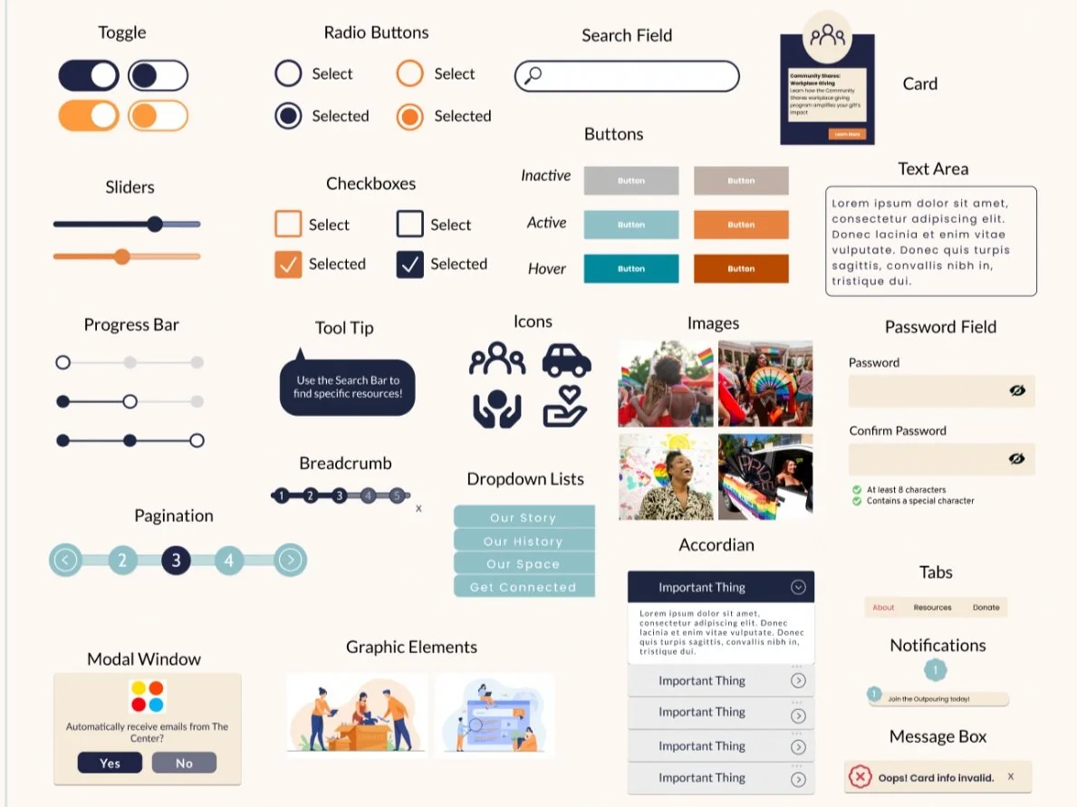
We made our interactive elements clear, accessible, and easy to use. We also ensured our design was comprehensive and future-proof by including atomic design that could be easily implemented by the Center down-the-line.
We designed our interactive components to improve user experience and comprehension on the site. Our goal was to minimize excessive text through intuitive visual cues.
Wireframing & Prototyping
For our first round of design, we focused on the site pages with the most frequent user traffic: the Home Page, the Event Calendar, the Resources Page, and the Donation Page. Each team member took on a page. I tackled the Event Page, because I liked the challenge of presenting a lot of information in a digestible package.
At each stage, from wireframing to high-fidelity prototyping, we came together as a team for constructive feedback and iteration. This allowed each team member to develop their own ideas, while maintaining cohesion between the four pages.
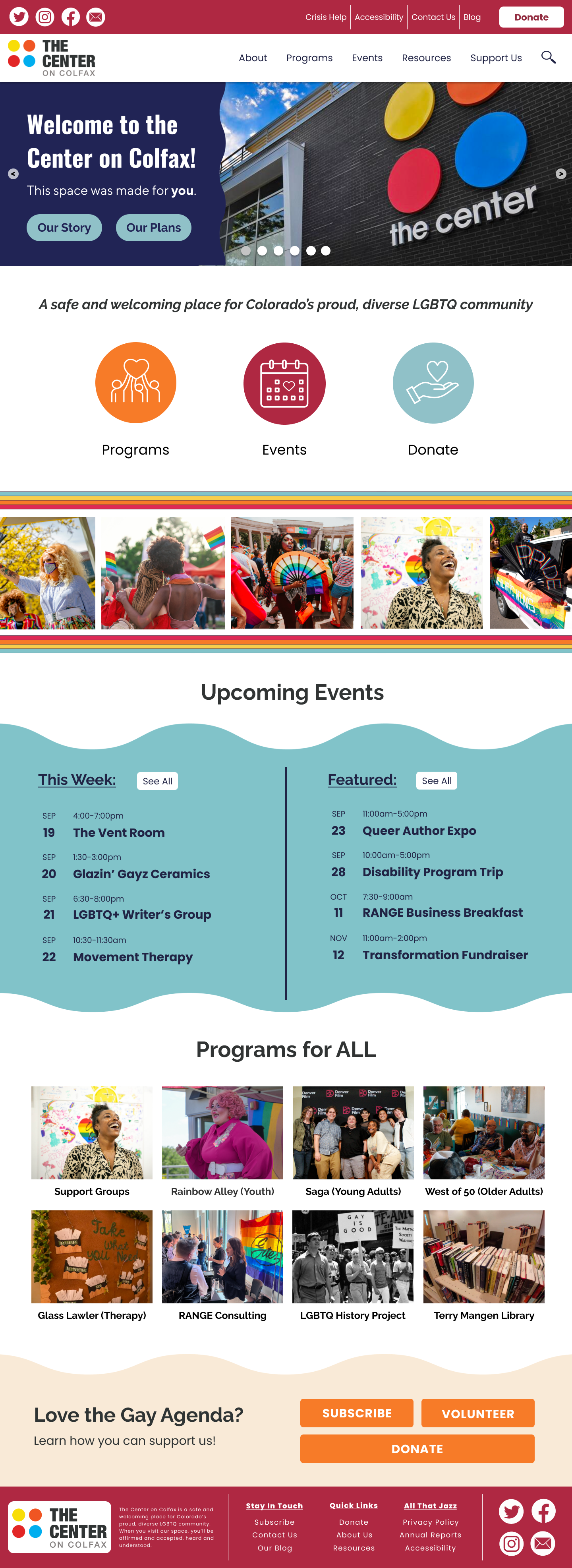
Home Page
The goals for the Home Page:
Infuse personality to reflect the center’s vibrant spirit.
Remove excessive white space and bring in more color.
Capture user attention with content blocks and images.
Improve navigation labels so users can find what they’re looking for quickly and easily.
Event Calendar
The goals for the Event Calendar:
Make it easy to find events specific to the user’s needs and interests.
Show all necessary information without being overwhelming.
Make it fun, but also easily interpreted.
Create clear and intuitive filters and categories.

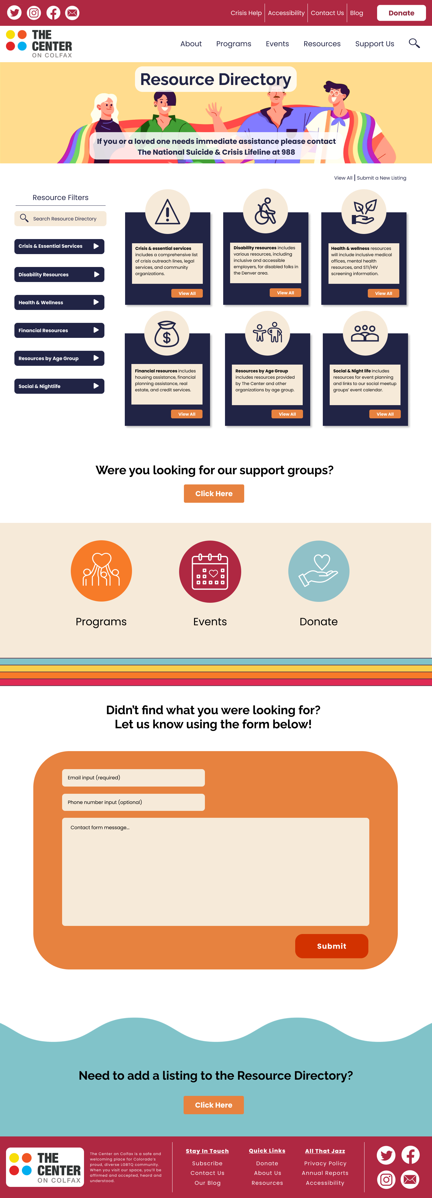
Resources Page
The Goals for the Resources Directory:
Condense and organize content for ease of use.
Use clear and simple navigation and related imagery.
Maintain a friendly, colorful appearance to reduce potential stress.
Donation Page
The Goals for the Donation Page:
Simplify the process with a designated donation page.
Make the donation box easily visible to encourage more frequent use.
Group donation options by color scheme to differentiate.
Prioritize the “everyday giver” by organizing content by most-to-least common donation frequency.

Iteration & Final Design
Empower, Engage, Enrich
We conducted four guerrilla tests on our prototype to identify any overlooked pain points and opportunities for growth. Our feedback was overwhelmingly positive, but we did make a few minor iterations to each page based on suggestions, including putting out-of-month days in gray, adding progress bars to donation forms, and updating spacing.
The final design helps the Center’s goal of empowering the LGBTQ Community of Denver by highlighting the variety of services and resources they offer with a colorful and accessible aesthetic. The design makes accessing those services and resources easy and intuitive. This will help the Center expand their outreach efforts and encourage sustained interaction between the community and the nonprofit. We look forward to working The Center on Colfax to implement this design in the future.
